Cultivating a Bold Brand Identity That Stands Apart
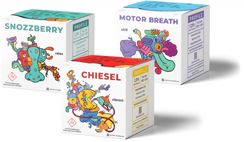
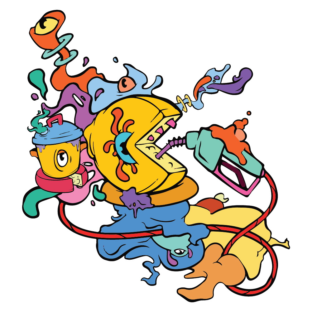
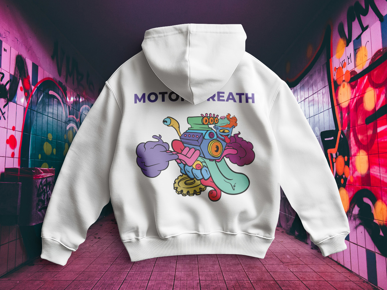
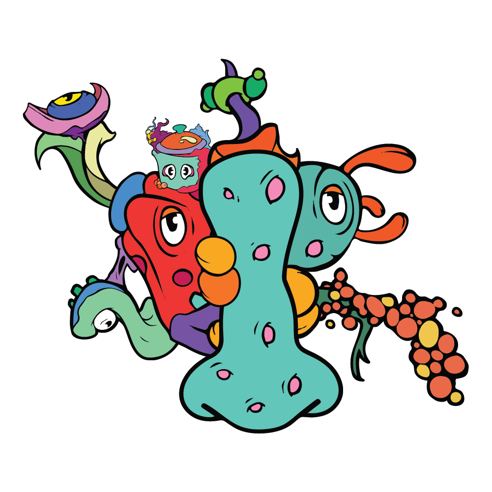
This brand development project for our cannabis client required more than a distinctive logo, it demanded a personality that stood out in an increasingly competitive market. For Potluck, the goal was to develop a playful, approachable identity that would immediately capture attention while creating a recognizable brand customers could connect with.
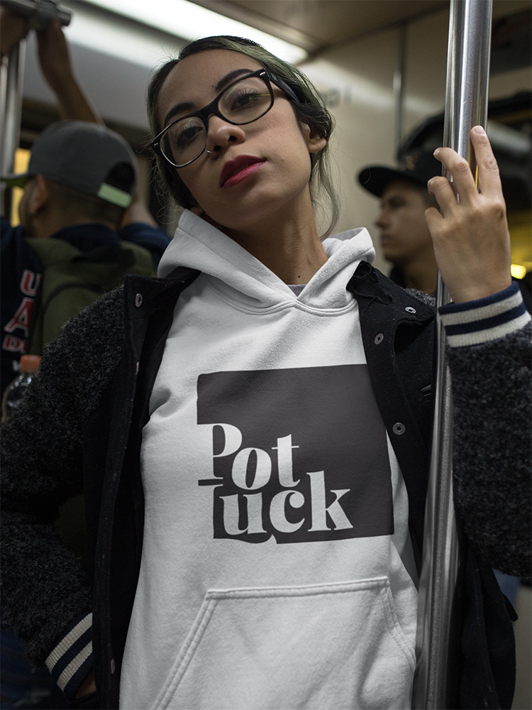
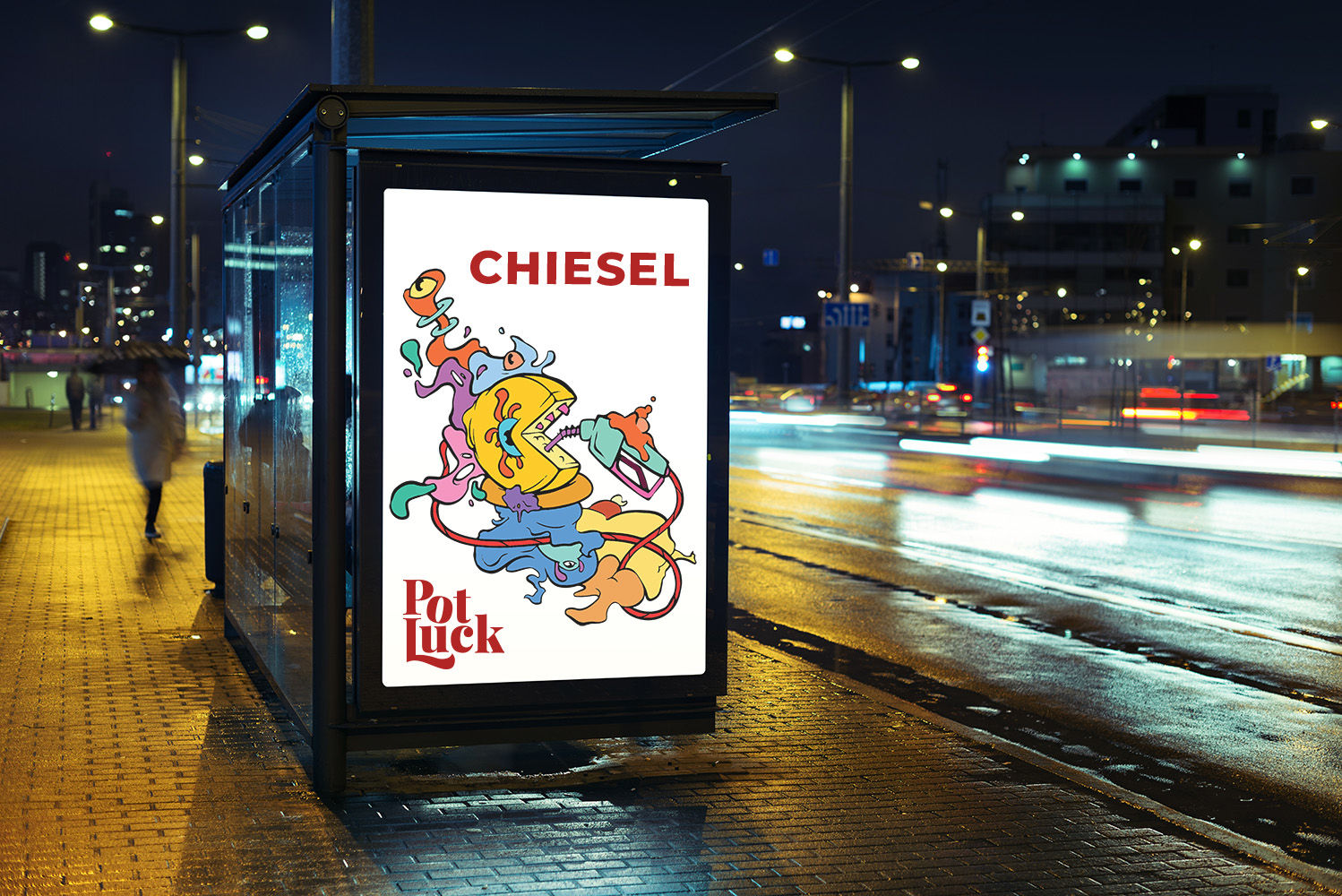
The logo was designed to complement the custom characters while standing confidently on its own. Clean typography, thoughtful proportions, and a bold yet approachable aesthetic create a mark that performs equally well across packaging, digital marketing, apparel, and promotional materials.
By combining strategic brand development with custom illustration and thoughtful logo design, we created Potluck a memorable identity that differentiates it from the crowded cannabis marketplace. The flexible brand system provides a strong foundation for future packaging, product extensions, merchandising, and marketing initiatives, allowing the business to grow while maintaining a consistent and recognizable visual identity.
Industry
Cannabis
Services
Brand, Strategy, Creative Direction
Projects
Brand Development, Logo Design, Packaging, Illustration
Red
#f53230
Blue
#6acdf0
Teal
#60c7b9
Purple
#7e6ab2
Primary Typography
Montserrat Extra Bold
Secondary Typography
Montserrat Bold
Vogue Salons Website
Brand Development, Creative Direction, Logo Design, Website Design